[ project ]
Paystack Design System for Legacy Products
Building a shared system across design and engineering
About the project
Type of work: Design systems, product design operations, UX infrastructure
Role: Design Systems Lead
Timeline: May 2022 - November 2023
Focus: Design tokens, component libraries, Figma libraries, developer collaboration, product migration, and design system adoption
Paystack had several legacy products with different interface patterns, component libraries, and implementation needs across web and mobile.
As the product ecosystem grew, the design team needed a clearer way to work across products without recreating components, making inconsistent design decisions, or slowing down handoff with engineering.
The work focused on creating a more coherent design system that could support designers and developers, improve operational efficiency, and create stronger alignment between Figma and code.
The challenge
Paystack’s products had grown with different design needs, patterns, and technical realities.
The challenge was not to force every product into one identical interface. It was to create a system that could bring more coherence across products while still respecting each product’s context.
Designers needed clearer libraries, reusable components, and stronger guidance. Developers needed a system that could connect to code, scale across platforms, and support implementation across web and mobile.
The challenge was to make the design process easier, reduce duplicated work, and create a shared foundation between design and engineering.
The direction
The design system was shaped around coherence, scalability, and cross-functional ownership.
Rather than treating the system as a Figma clean-up exercise, the work focused on the foundations needed for long-term adoption:
Audit existing components and libraries
Define design principles
Revamp design tokens across Figma and code
Create master component libraries for desktop and mobile
Build Figma product libraries for designers
Integrate tokens and components into product code libraries
Support adoption through documentation, updates, and collaboration with engineering
Migrate selected products into the new system
This shifted the work from a visual library into a shared design and engineering infrastructure.
Before and after
Fragmented component libraries → Shared product libraries
Repeated design decisions → Reusable foundations
Figma-focused assets → Figma and code alignment
Inconsistent legacy patterns → More coherent product experience
Design-only ownership → Cross-functional system ownership
Handoff-heavy process → Clearer design-development collaboration
Three key insights
1. Coherence mattered more than strict consistency
Paystack’s products had different requirements, so the system needed to create alignment without flattening product differences.
2. A design system only works when it reaches code
The work could not stop at Figma. Tokens and components needed to be integrated into product code libraries to support real adoption.
3. Adoption needed communication, not just documentation
Weekly updates, digests, and reports helped keep design and engineering aligned on progress, scope, timelines, and resourcing.
Building the system beneath the interface
A major part of the work focused on design tokens as the foundation of the system.
Tokens were revamped across Figma and the codebase, helping create a stronger connection between design decisions and implementation across products.
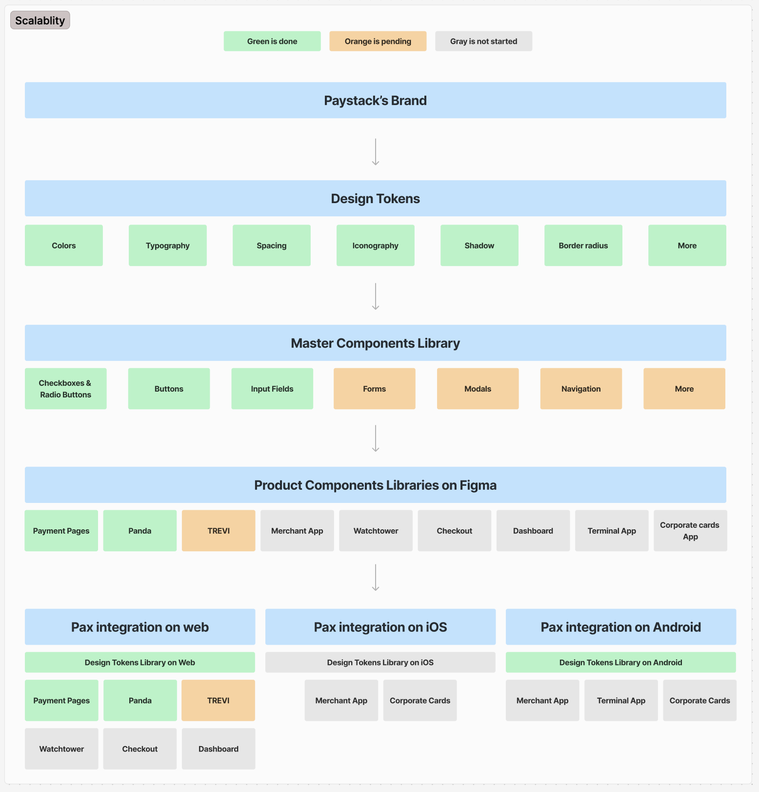
[screenshots from a design library immpact for one of the internal paystack products]
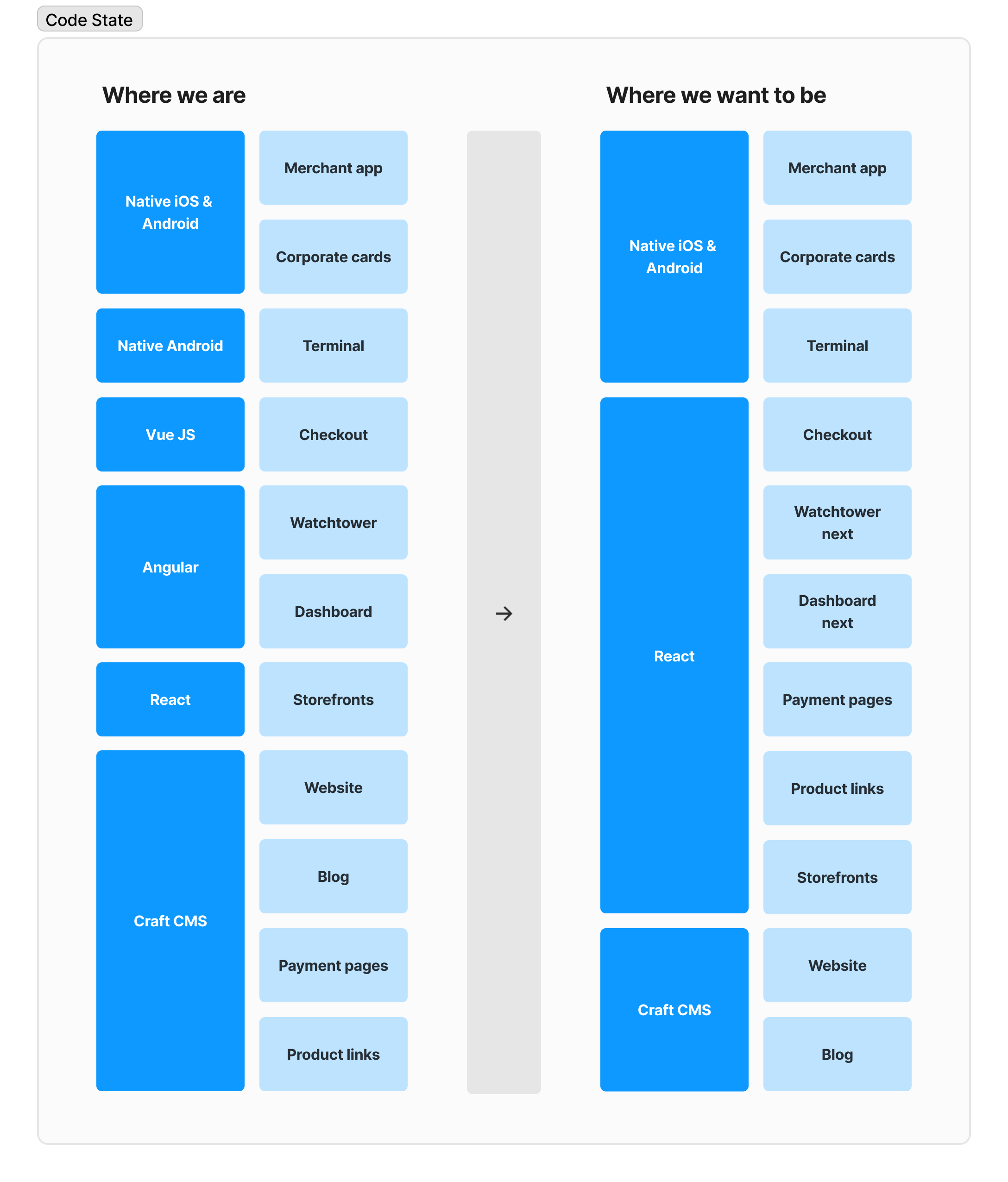
[screenshots from design system in progress]
Impact
Shifted the guidelines from design reference to implementation tool
Helped reposition the Aani eDDA guidelines as a resource that could support product, design, business, compliance, and technical teams, rather than serving primarily as a design document.
Created a clearer foundation for consistent implementation
Reduced ambiguity around requirements, terminology, and screen behavior, giving participating banks a stronger basis for delivering aligned eDDA experiences.
Improved discoverability and usability of guidance
Introduced clearer structures, quick guides, and supporting resources that made it easier for teams to find relevant information and navigate complex journeys.
Strengthened confidence around edge cases and requirements
Expanded coverage of alternative scenarios and clarified mandatory versus recommended guidance, helping teams make implementation decisions with greater certainty.
Supported multiple teams without adding unnecessary complexity
Helped shape documentation that could serve designers, developers, product managers, and implementation teams through clearer organization and more targeted guidance.
Brought research and implementation feedback into decision-making
Combined audits, cognitive walkthroughs, and stakeholder interviews across multiple LFIs to ensure improvements reflected real implementation challenges and operational needs.
Further reading
I wrote more about the thinking behind this project in Design Systems for Legacy Products: A Developer-Driven Approach for Designers.
The article explores building design systems for legacy products, the importance of developer collaboration, and lessons from creating a shared foundation for design and engineering.
disclaimer
This is a high-level public summary of the project. Detailed process artifacts, internal discussions, and operational work are kept private. Full case study available upon request.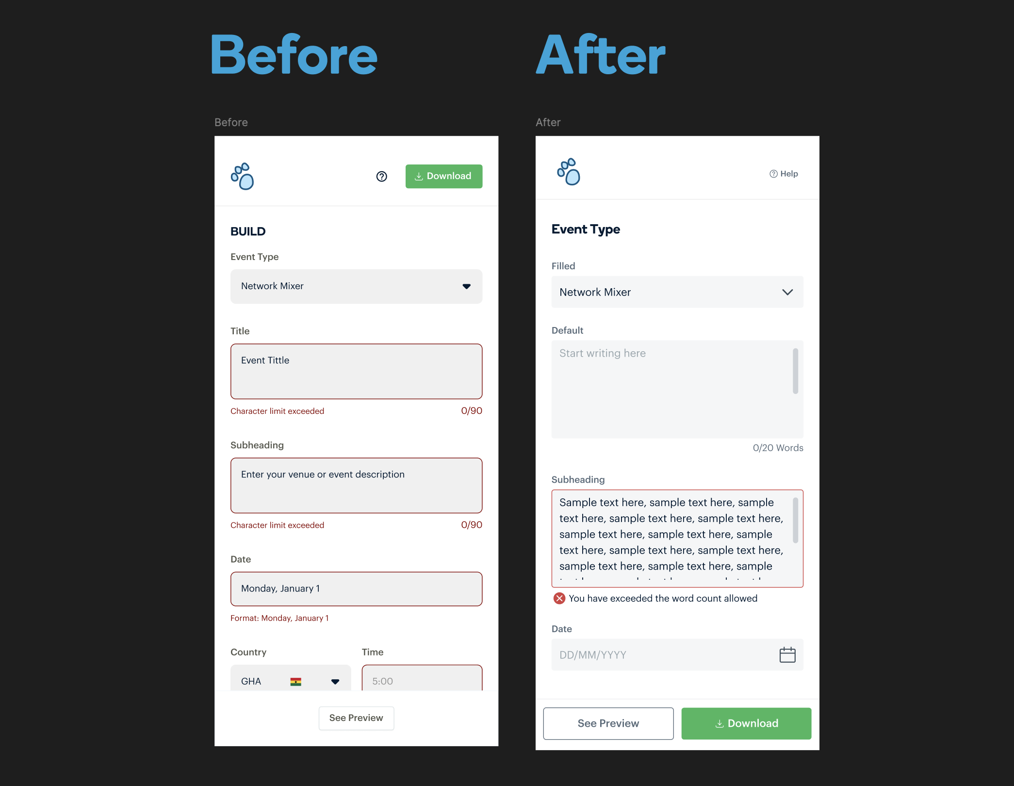
[screenshots from a design library immpact for one of the internal paystack products]
[ more projects ]
-
![]()
The Atlas Project
-
![]()
The Echo Project
-
![]()
The Brightline Project
-
![]()
The Northgrid Project