[ project ]
Improving Aani eDDA Guidelines for Banks
Helping banks implement clearer Aani eDDA journeys across mandate setup, authorization, and edge cases.
About the project
Type of work: UX research, service design, information architecture, experience audit
Role: Lead Service Designer
Timeline: April – May 2025
Focus: Instant payments, eDDA journeys, implementation guidance, information architecture, terminology, edge cases, and accessibility
I worked on improving the Aani eDDA UX Guidelines used by Licensed Financial Institutions (LFIs) to implement electronic direct debit experiences.
Starting with a UX audit and stakeholder interviews, the work focused on improving the structure of the guidelines, clarifying requirements, strengthening user flows and edge cases, and simplifying terminology. The result was a more practical and scalable guideline system that better supported consistent eDDA implementations across banks.
The challenge
The existing guidelines were useful but difficult to apply. Teams struggled with:
Dense content and unclear terminology
Missing edge cases and error scenarios
Confusion between mandatory and optional guidance
Navigation issues
Limited links between UX and technical behavior
The goal was to make the guidelines easier to understand and implement without restricting the flexibility needed by different banks.
The direction
The work focused on making the guidelines more practical by:
Clarifying mandatory and recommended guidance
Improving screen flows and edge cases
Simplifying terminology
Adding screen-level guidance and annotations
Making the documentation easier to navigate
Before and after
Design-focused guidance → Multi-role guidance
High-level principles → Practical screen guidance
Text-heavy explanations → Visual flow maps
Unclear requirements → Clear mandatory rules
Missing error states → Edge-case coverage
Confusing terminology → Shared glossary
Difficult navigation → Better structure and quick guides
Three key insights
1. Teams needed clarity, not just more information
The guidelines contained valuable information, but content was often dense and terminology was difficult to interpret. Teams needed clearer explanations, annotations, and context around journeys so they could understand what applied, when it applied, and how to use it.
2. Requirements needed to be transparent and easy to distinguish
Implementation teams struggled to tell the difference between mandatory requirements and recommendations. Error states and alternative scenarios were also underrepresented. The guidelines needed to make requirements more visible and provide stronger coverage of edge cases to reduce ambiguity.
3. Different teams needed different kinds of guidance
Designers, product managers, developers, and implementation teams all used the guidelines differently. Navigation issues and limited links between UX and technical behavior made it harder for teams to find what they needed. The documentation needed to support multiple audiences without becoming fragmented.
a glimpse into the process
The work began with a UX audit and stakeholder interviews with implementation teams across four LFIs to understand where the existing guidelines created friction.
Insights from the research were used to improve the information architecture, clarify mandatory requirements, strengthen user flows and edge cases, simplify terminology, and make the documentation easier to navigate for different audiences involved in implementation.
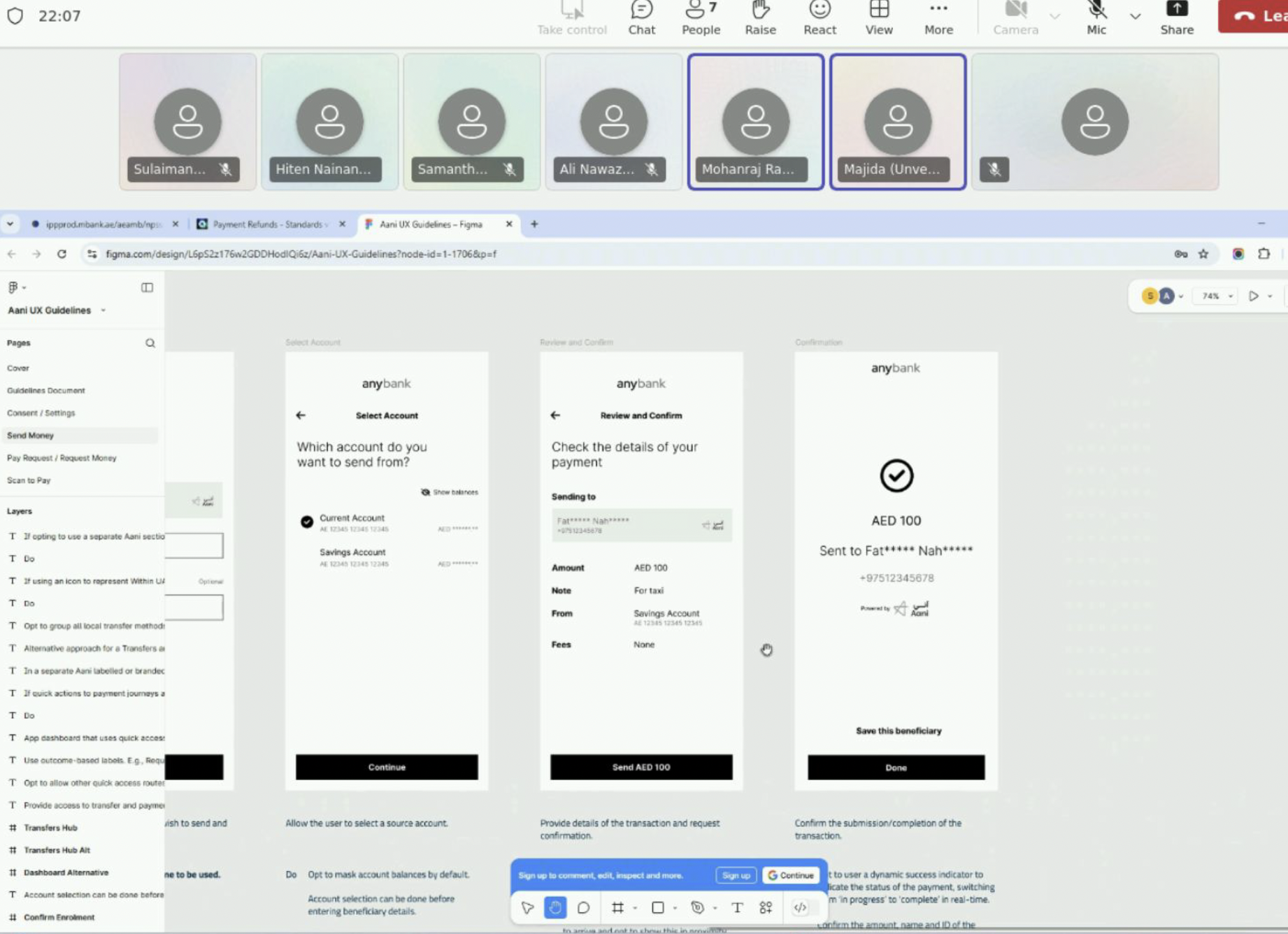
[snapshot from the stakeholders interviews]
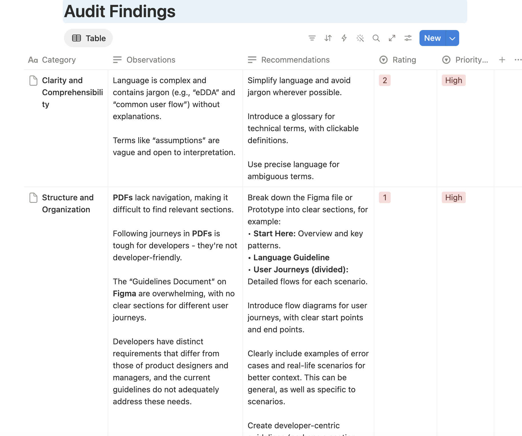
[screenshots from findings report]
Impact
Shifted the guidelines from design reference to implementation tool
Helped reposition the Aani eDDA guidelines as a resource that could support product, design, business, compliance, and technical teams, rather than serving primarily as a design document.
Created a clearer foundation for consistent implementation
Reduced ambiguity around requirements, terminology, and screen behavior, giving participating banks a stronger basis for delivering aligned eDDA experiences.
Improved discoverability and usability of guidance
Introduced clearer structures, quick guides, and supporting resources that made it easier for teams to find relevant information and navigate complex journeys.
Strengthened confidence around edge cases and requirements
Expanded coverage of alternative scenarios and clarified mandatory versus recommended guidance, helping teams make implementation decisions with greater certainty.
Supported multiple teams without adding unnecessary complexity
Helped shape documentation that could serve designers, developers, product managers, and implementation teams through clearer organization and more targeted guidance.
Brought research and implementation feedback into decision-making
Combined audits, cognitive walkthroughs, and stakeholder interviews across multiple LFIs to ensure improvements reflected real implementation challenges and operational needs.
disclaimer
This is a high-level public summary of the project. Detailed process artifacts, internal discussions, and operational work are kept private. Full case study available upon request.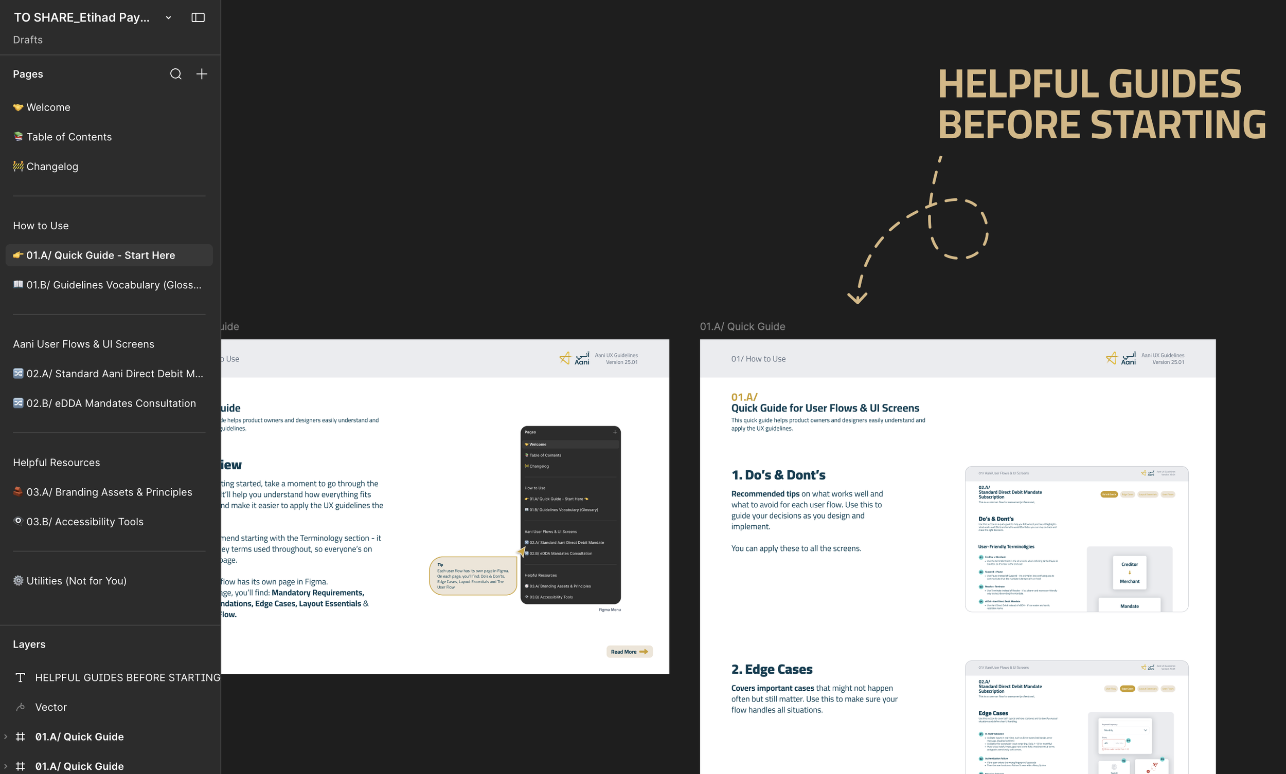
[screenshots from the Aani UX Guidelines]
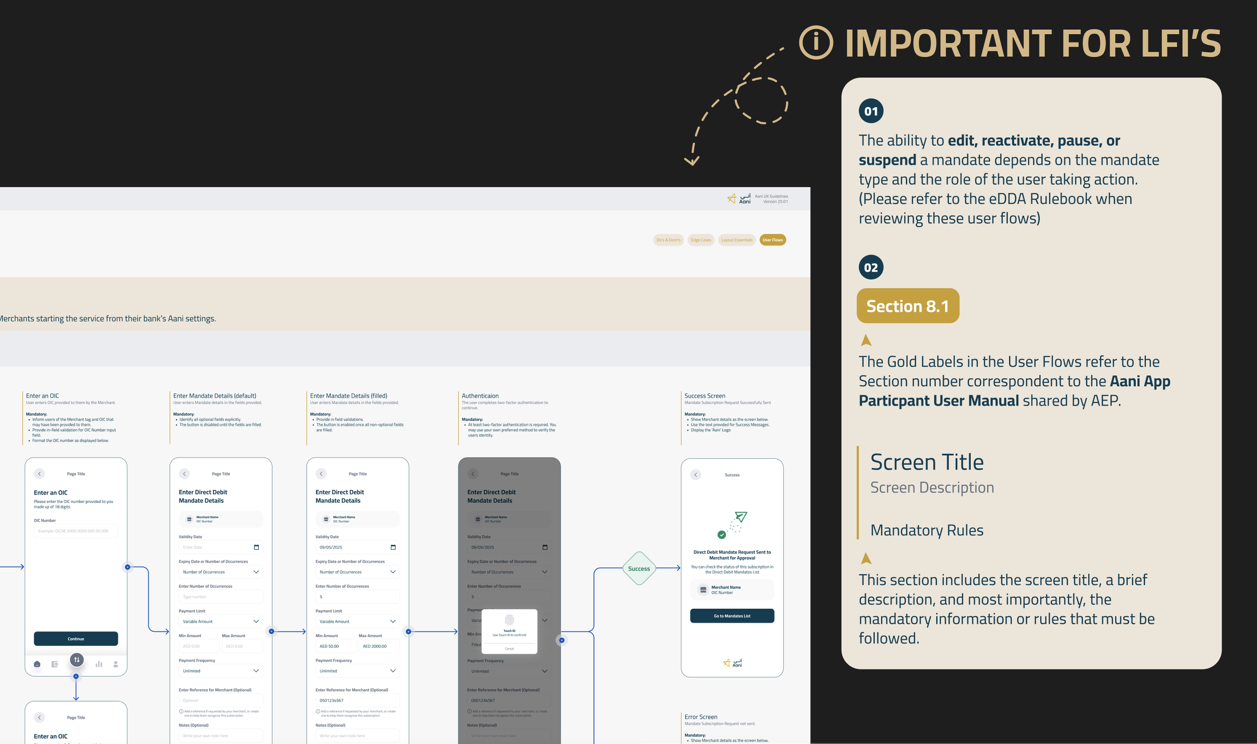
[screenshots from the Aani UX Guidelines]
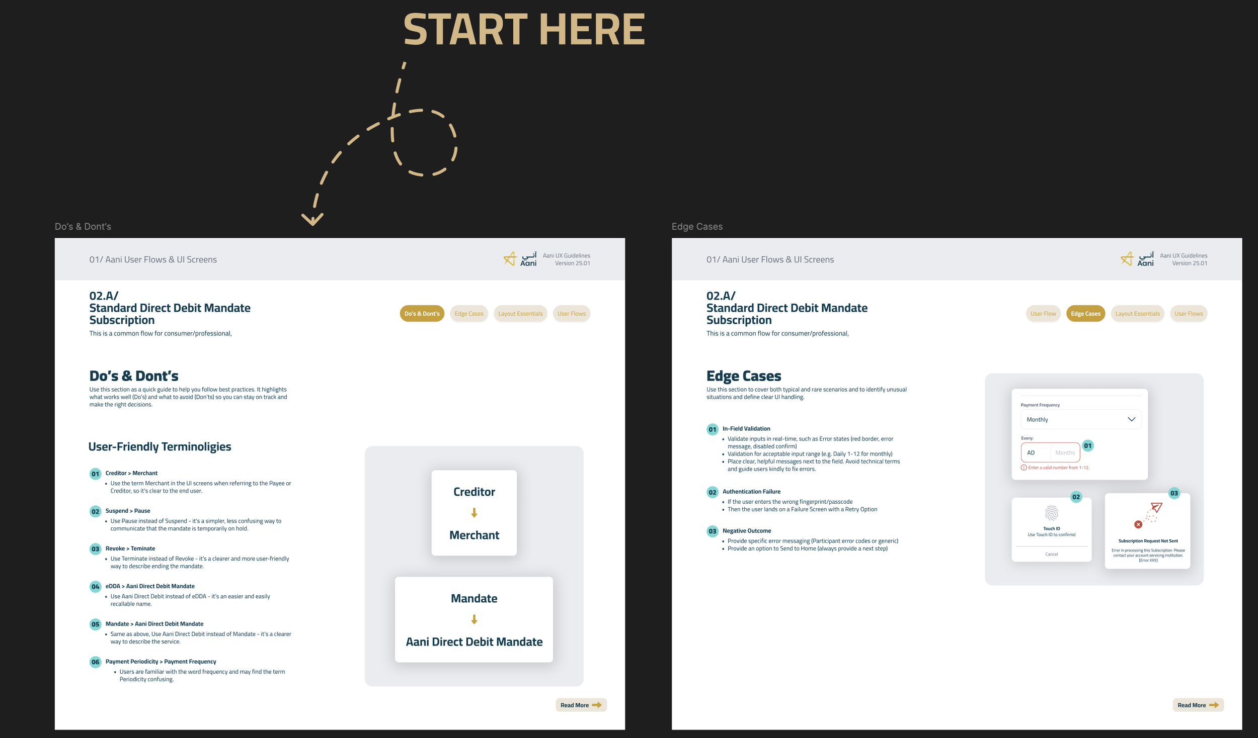
[screenshots from the Aani UX Guidelines]