Creating a Design System for Paystack’s Legacy Products
A good design system empowers both designers & developers
Project Snippet
At Paystack, we saw an opportunity to make our design process smoother and more intuitive. With many components and libraries in use, we aimed to build a design system that simplified choices and reduced repetition.
By unifying our system, we made life easier for designers and developers, helping them work efficiently while ensuring our web and mobile products stayed consistent across platforms.
Vision & Strategy
Set Design Principles
The objective is to improve operational efficiency, starting with the design team and cascading throughout the rest of the company. So I outlined principles by which we would conduct the work:
Coherence over Consistency Our products have different requirements and user needs, that’s why it is important for our Design System to maintain coherency rather than enforcing consistency across all products.
Usability and Accessibility We aim to build products that are intuitive, effective, and accessible to all users, regardless of their abilities.
Efficiency over Speed By providing pre-built design components and templates, our designers can focus on problem-solving and user experience.
Collaboration between designers and developers helps establish and maintain a shared understanding of design principles, styles, and components.
Scalability As we grow and expand, a design system helps ensure that new products can be added quickly and easily by old and new designers, while still maintaining coherency.
The Process
I won’t cover every step in detail, as the process is fairly standard for most design systems. Instead, I’ll focus on what set our approach at Paystack apart and the pivotal moments that shaped our success.
Implement & Integrate
Changes weren't limited to the design team or Figma alone; they needed to be integrated across products and platforms.
The plan involved:
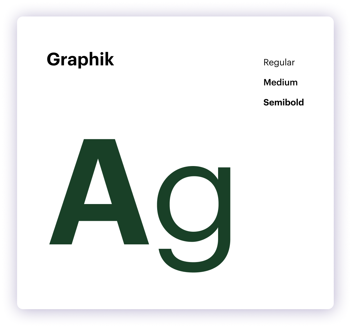
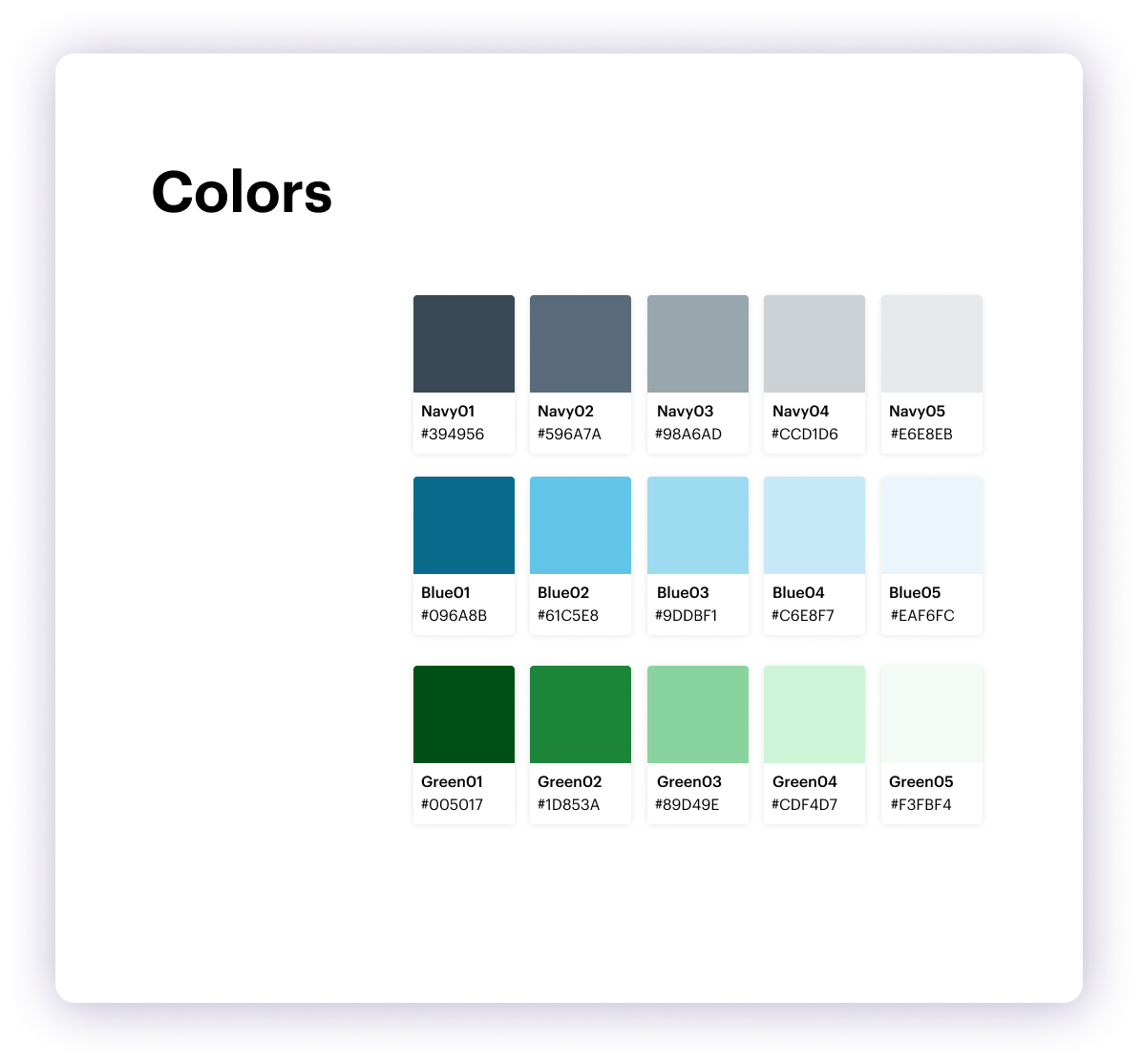
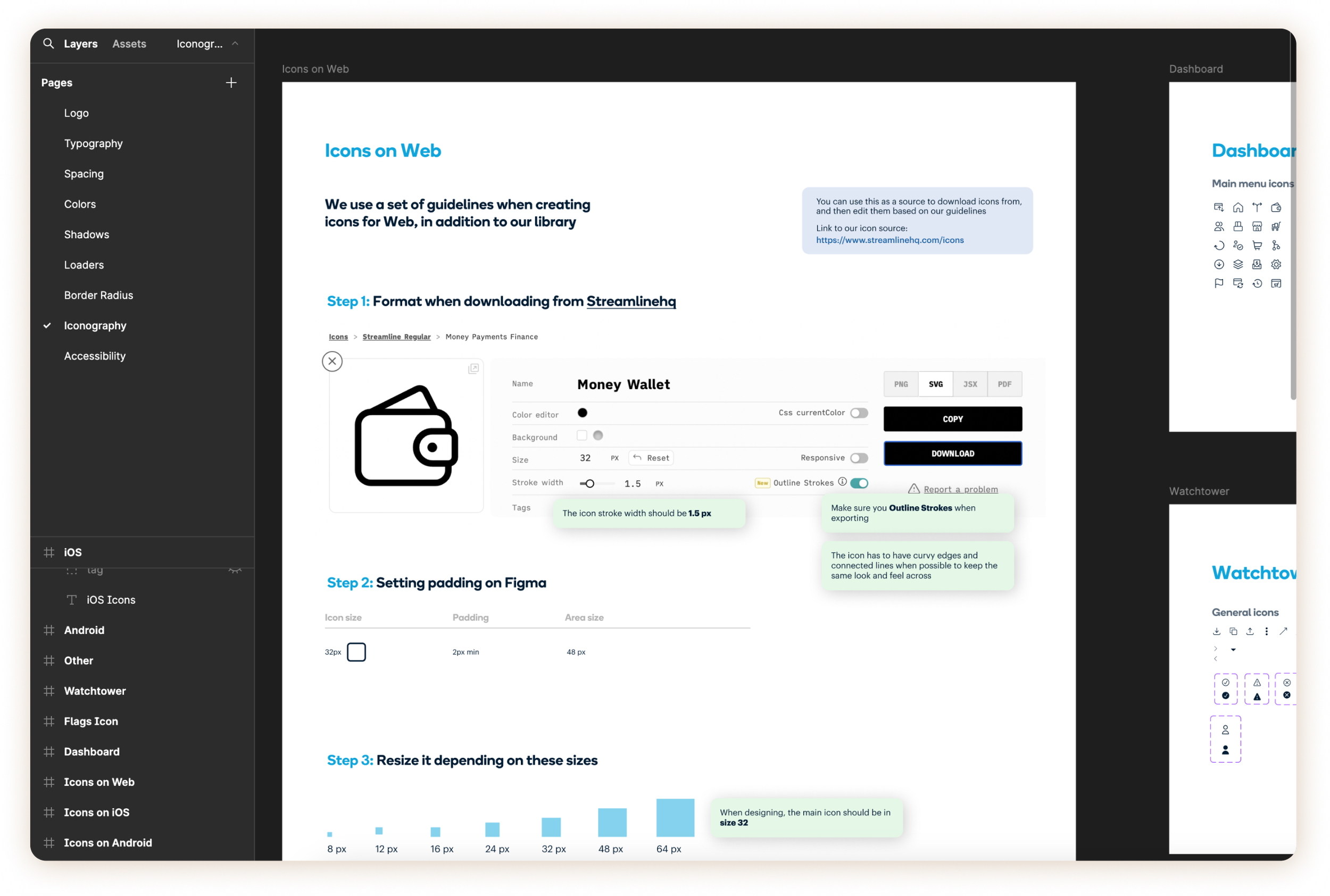
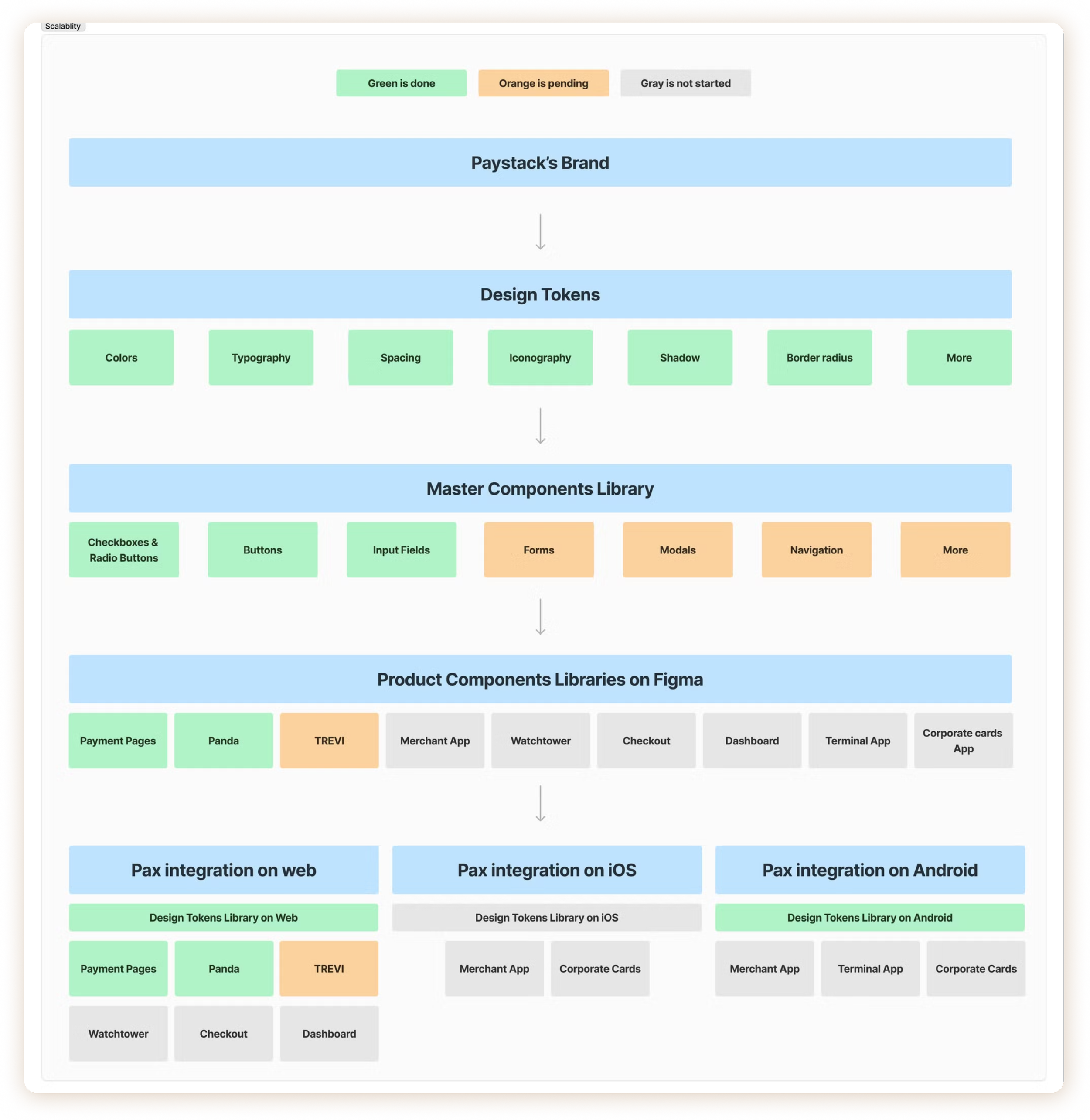
Building Design Tokens first to set the foundation for the design system.
Integrating the Design Tokens within our products in the code library, ensuring consistency between design and development.
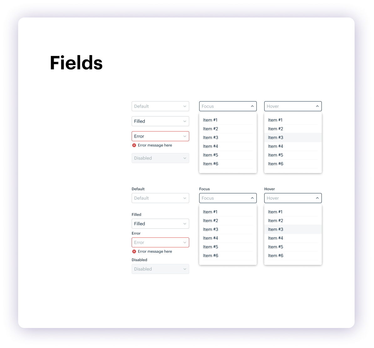
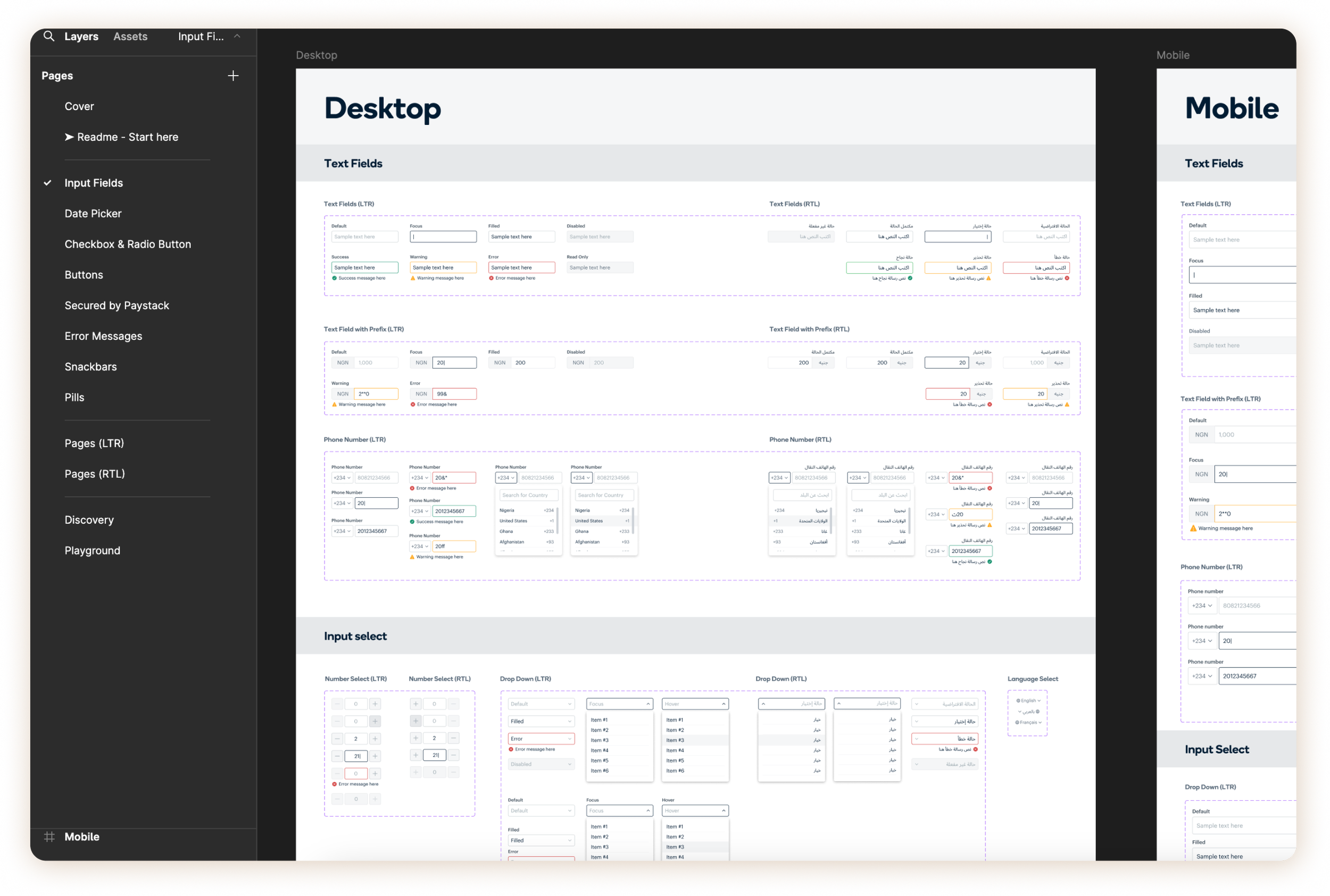
Creating master component libraries for key components across desktop and mobile, ensuring both designers and developers could use them.
Establishing a Figma Components library, making it easier for designers to access and identify the correct components and colors.
Definition of Success
The product component libraries are being used by designers.
The Design Tokens and Component Libraries for different products have been integrated with mobile and web.
Audit → Design & Document → Implement & Integrate → Adopt & Train → Maintain & Evolve
Design & Document
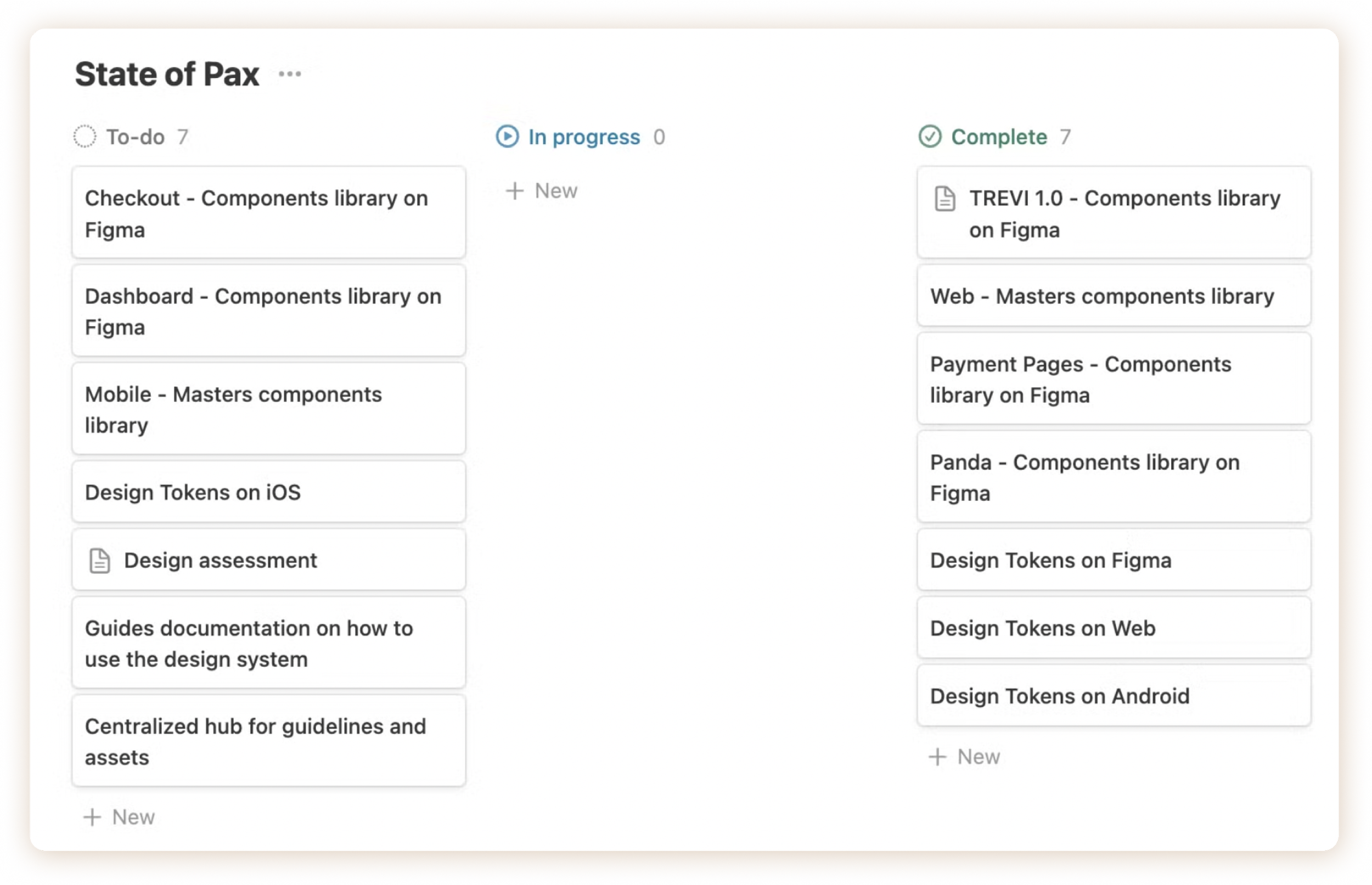
Documentation played a key role throughout our design process. I provided weekly updates to the design and engineering teams through digests or reports, detailing our completed work, current tasks, and upcoming plans.
This practice helped us align on timelines, scope, and resource allocation, ensuring both design and engineering were in sync.
The Result
Revamped design tokens across Figma and codebase, ensuring alignment and scalability throughout our products.
Established 3 Figma product libraries, enabling designers with easy access to consistent components and simplifying the handoff process for developers."
Successfully migrated 2 products to the new design system with full code integration.
Screenshots
Final Thoughts 💭
About 50% of my work as a design systems lead was with developers.
What I learned is that a strong system isn’t just about polished components, it’s about building them together. Engineering practices like modularity and version control gave us the structure we needed, but the real impact came from the ongoing collaboration. By staying in sync and sharing ownership, we created a system that was not only scalable and efficient but also truly cross-functional.